Datalab Dashboard: Turning Fragmented Data into Confident Decisions
Case study focus
The Datalab Dashboard initiative explored three key areas: Credit Consumption, Sales Performance, and Marketing/Channel Performance.
This case study focuses on my end-to-end design process—from discovery, problem framing, and information mapping through to information architecture and dashboard design. It highlights how I translated complex business and data requirements into a clear, focused product experience.
ROLE AND CONTRIBUTION
Product Design
Discovery & Problem Framing
Information Architecture
Dashboard & Data Visualization Design
PLATFORMS
Web App
B2B SaaS
INDUSTRY
Spatial Data Platform (BigGeo DataLab)
Introduction
What is Datalab?
Datalab is BigGeo’s workspace for spatial data. It brings datasets, data products, and data-business workflows into one place, enabling data providers to manage, commercialize, and activate their data across the BigGeo ecosystem.
What is the Datalab Dashboard for?
The Datalab Dashboard was introduced to give data providers a quick, structured view of their business performance across three key areas:
Credit Consumption — monitor and adjust credit usage for data management.
Sales Performance — understand sales activity and optimize revenue from data products.
Channel Performance — monitor listing engagement and improve conversion.
The Challenge
Turn a broad set of business requirements into a focused dashboard experience that helps data providers understand what is happening, why it is happening, and where they may need to act.
Discovery & Problem framing
What do data providers actually need to know to manage their business efficiently?
From requirements to user questions
Credit Consumption
How are my credits being consumed, and do I need to adjust?
Sales Performance
How are my products performing commercially?
Channel Performance
How effectively are my channels attracting and converting buyers?
Stakeholder interviews
Goal
I used stakeholder discussions to validate and challenge my initial hypotheses about user goals, business needs, and information requirements.
Process
Starting with the initial product brief to understand the high-level project intent and known requirements, I translated it into a hypothesis model centered on: Target user → User goal → User question → Information needed. I then validated and refined this model through discussions with Product, Sales, and Platform stakeholders.
Output
The session established a shared understanding of the product problem, user/business goals, constraints, and information requirements. This also revealed three distinct dashboard areas, each organized around a different set of user questions and decision-making needs.
Process — Stakeholder interview kick-off — Validating my assumptions, clarifying ambiguity, and building a shared requirement model that can guide the product structure (Ex. Credit Consumption Dashboard).
Output — Problem framing (Ex. Credit Consumption Dashboard).
Problem Statement
Data providers need a clear way that enables them to monitor business performance, understand changes, adjust their activities, and make informed decisions to improve business outcomes. This problem was visible across three business areas: Credit Consumption, Sales, and Channel Performance.
Information Modeling & Architecture
Information modeling
I decomposed the validated user questions into specific information requirements, modeled the relationships between those information elements, grouped them into meaningful information domains, and prioritized them according to user importance, decision impact, and urgency. This information model became the foundation for the dashboard's IA and hierarchy.
Information modeling — Validating user questions and identifying relationships between the information pieces (Ex. Credit Consumption Dashboard).
From one dashboard to three focused experiences
Separate the three business areas into focused dashboards, while maintaining a consistent experience across DataLab.
Original concept: one dashboard, three business areas. Research-driven direction: three focused dashboards, one coherent dashboard experience. This became the first major product decision — separate the experiences by business purpose while maintaining a consistent structure and interaction model across them.
Dashboard Information Architecture (Ex. Credit Consumption Dashboard).
Why this structure
Purpose
One clear business question per experience.
Information hierarchy
Prioritize what matters most for that context.
Analytical relationships
Connect metrics that help explain performance.
Action path
Help users move from overview to investigation.
Separate the questions. Unify the experience.
Design
The design principles
Minimal, but effective
Give users the right level of information at the right depth. Start with a concise overview, then provide increasingly detailed information for users who need to investigate — keep the initial view focused while preserving depth for exploration.
Organize information around user questions
Structure information around what users are trying to understand, rather than how the underlying data or business systems are organized — organize around user mental models and decisions.
Give users context
Avoid presenting isolated numbers without enough information to interpret them. Pair metrics with trends, comparisons, time context, status, and related metrics — a metric becomes useful when users can understand what it means and how it is changing.
Prioritize what requires attention
Surface important changes, trends, and exceptions before detailed information. The dashboard should help users recognize what deserves attention, not make them scan every metric equally.
Prioritize what matters, provide enough context to understand it, organize around user questions, and reveal detail progressively.
Design Decisions
A shared dashboard pattern
Every dashboard follows the same progression: KPI Summary, then Trend / Performance, then Driver / Breakdown, then Insights — establish the current state, provide context, explain the drivers, surface opportunities.
The pattern remained consistent across the product, while the content and analytical relationships were adapted to each business area.
Dashboard pattern — A shared design pattern built from the result of Information Modeling.
Goal: create consistency at the experience level, not by forcing identical content into every dashboard.
Deep Dive: Credit Consumption Dashboard
Turning complex credit data into a decision-support experience
Credit Consumption brought together multiple credit types, spending metrics, forecasts, expiration information, and consumption drivers. The design challenge was to create a clear hierarchy that helps users understand their current position, recognize what requires attention, and investigate the factors behind their consumption.
The information was organized around the user's decision journey rather than the underlying data structure — establishing a focused overview while preserving deeper context for investigation.
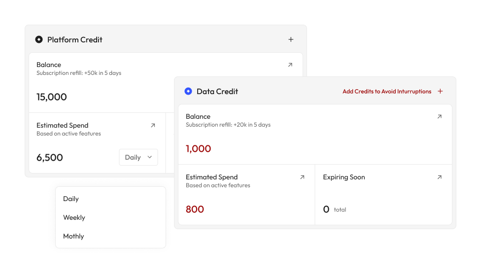
Decision 1 — Establish the current credit position first
Design problem: Users need to understand their current credit situation before interpreting historical or projected consumption.
Decision: Lead the experience with the most important current-state information — Balance, Estimated Spend, and Expiring Soon — with Platform and Data Credit clearly distinguished.
Rationale: This gives users an immediate understanding of where they stand and surfaces information that may require attention.
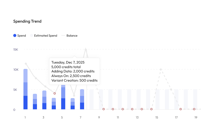
Decision 2 — Make spending trends explain the current state
Design problem: A balance or spending figure alone does not explain whether consumption is increasing, decreasing, or likely to change.
Decision: Use the spending visualization to connect actual spending, estimated spending, and balance over time.
Rationale: Users can understand not only what they have spent, but how consumption is evolving and what that may mean for their remaining credits.
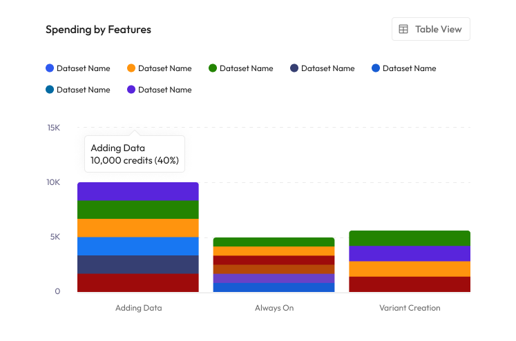
Decision 3 — Surface what is driving consumption
Design problem: Knowing total consumption does not tell users what is causing it.
Decision: Provide a breakdown of consumption across the key features — Adding Data, Always On, and Variant Creation.
Rationale: Making the drivers visible helps users move from "What happened?" to "Why is this happening?" and identify where further investigation may be needed.
Decision 4 — Prioritize attention without overwhelming the overview
Design problem: The dashboard contains a large amount of information, but not everything deserves equal visual weight.
Decision: Use visual hierarchy and progressive disclosure to keep the primary view focused while giving secondary information enough context for deeper investigation.
Rationale: Users can quickly scan the overall state of their credits without losing access to the detail needed to understand performance.
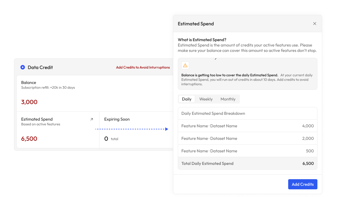
Outcomes
As a result, the dashboard is not just a collection of metrics — it provides a structured experience that helps data providers monitor consumption, identify potential issues, and investigate performance with the right level of context.
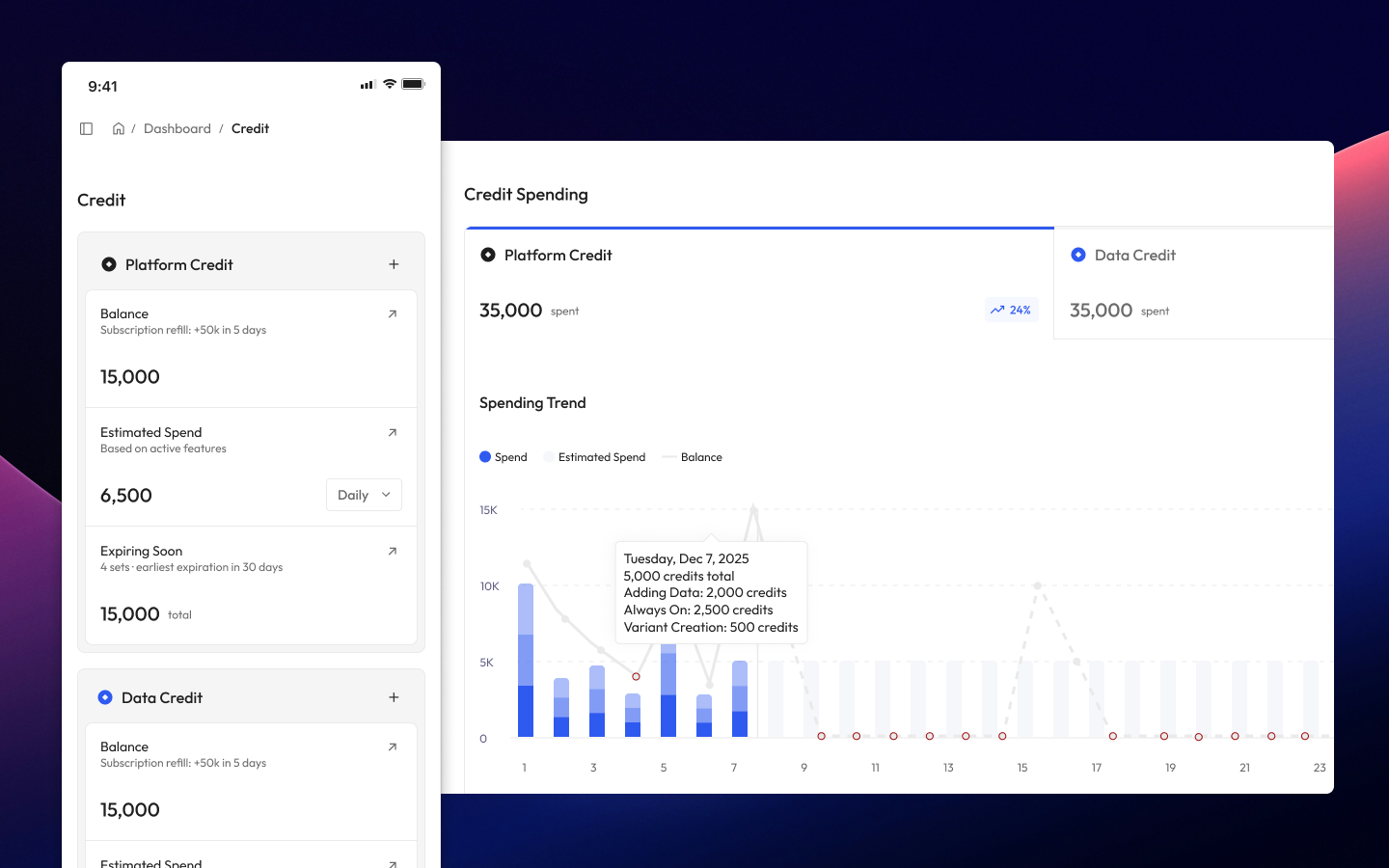
Design Outcome — Credit Consumption Dashboard
What's my current spend? How is it changing? What's driving it? Where should I investigate? The decisions were designed to make the dashboard scannable at a glance while still supporting deeper analysis when needed.
Extend the Pattern
One design logic, adapted to three business contexts
The pattern was then adapted to the other two dashboards: Sales and Channel Performance. Each follows a familiar path from overview to deeper understanding, while its metrics, relationships, and insights remain specific to the business question.
Sales Performance — State → Trend → Analytics → Product / Sales Channel driver. Understand commercial performance, how revenue and transactions are performing, and what is contributing to sales.
Channel Performance — State → Funnel → Engagement → Conversion opportunity. Understand channel activity, how users move through the listing funnel, and where conversion can be improved.
This allowed the three experiences to feel like one product system without becoming three copies of the same dashboard.
Design Outcome — Sales Dashboard.
Design Outcome — Channel Performance Dashboard.
The Impact
From one broad dashboard requirement to three focused experiences
The project evolved from a broad dashboard requirement into three focused experiences, each designed around distinct business questions while maintaining a consistent analytical pattern across the product.
User, product, and business impact
User impact — less cognitive effort
Users can move from monitoring to investigation with less cognitive effort — understanding what is happening, why it is happening, and where to focus next.
Product impact — extensible architecture
Business areas can evolve independently while remaining consistent within one product experience.
Business impact — more proactive business management and optimization
Credit: Credit visibility → better resource allocation → more efficient credit usage.
Sales: Sales visibility → identify commercial opportunities → optimize sales activity.
Channel: Channel visibility → identify friction → improve conversion → better customer experience.
Final Design
Credit Consumption Dashboard (Desktop & Mobile).
Sales Dashboard (Desktop & Mobile).
Channel Dashboard (Desktop & Mobile).
THE END
Thank you
Thanks for taking the time to explore this case study. I hope it gave you a glimpse into how I approach complex product problems—from framing the problem and uncovering user needs to structuring information, and designing the experience.