Redesign Onix Website
Corporate website
Team: Onix AS
My role: UX/UI Designer
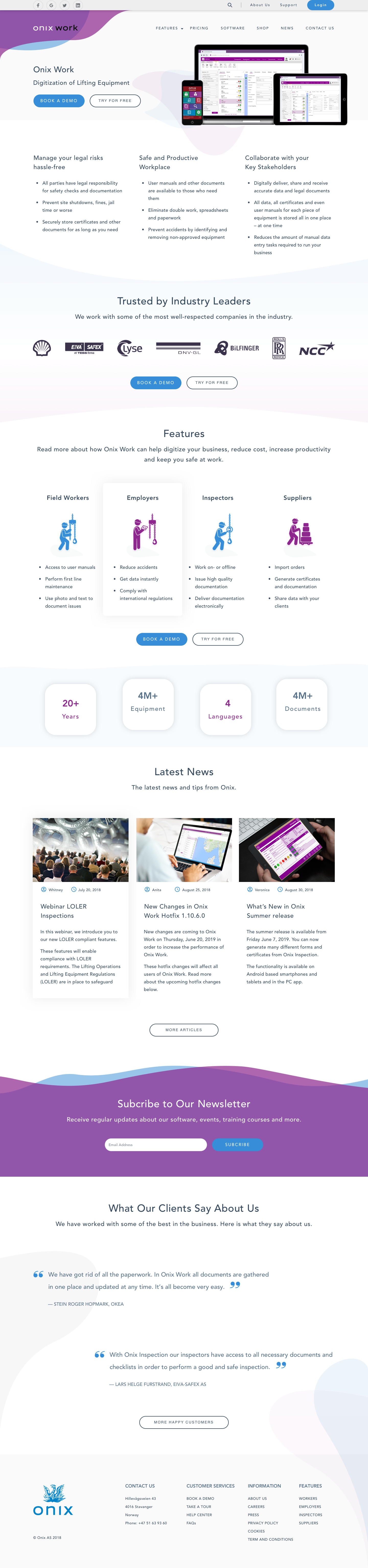
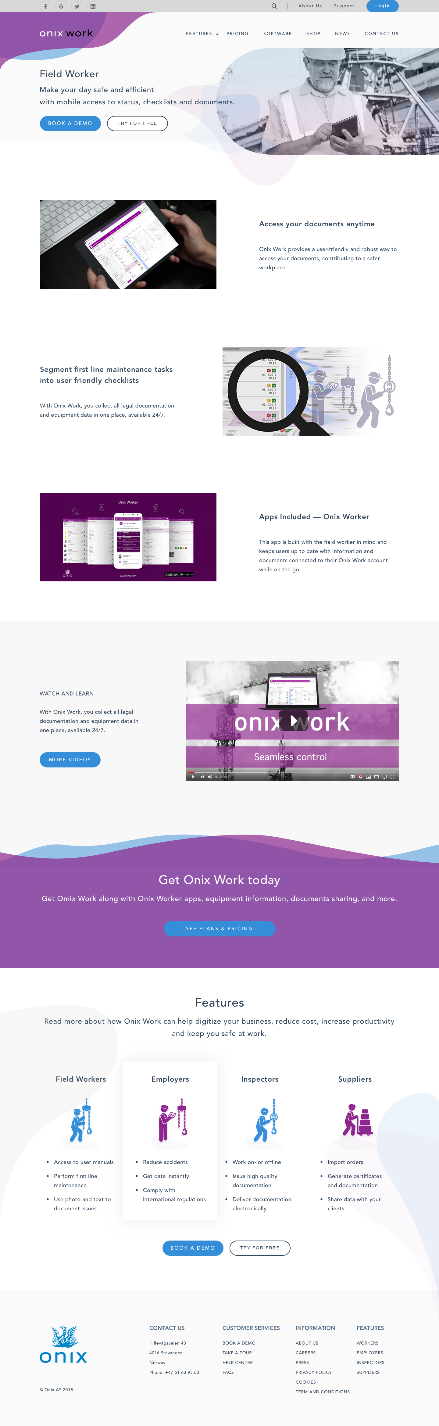
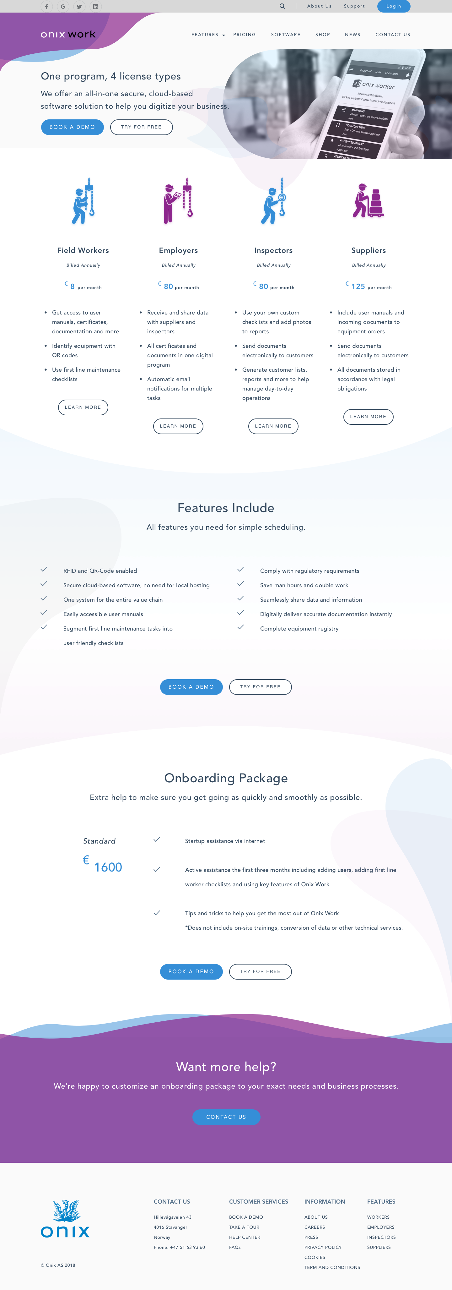
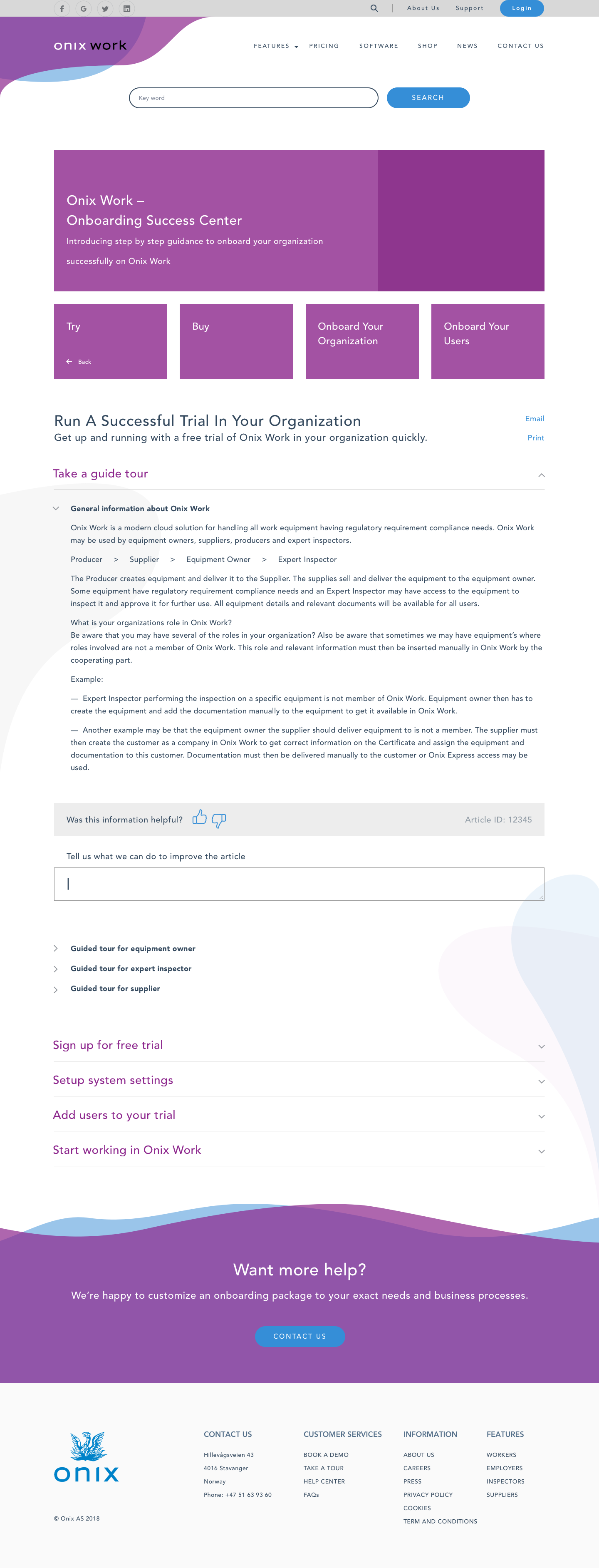
Onix.com is to help customers learn about Onix's core product - Onix Work - as well as an efficient tool to support customers, also up-to-date the upcoming releases and events of the company.
Background Information
Onix is a technology firm, offers software solutions to clients in the lifting industry in Scandinavian. The onix.com mission is to afford every buyer with confidence when buying and using Onix Work application. The company wanted to develop a clear UX strategy for Onix Work that provides its target users with real value and instant support services.
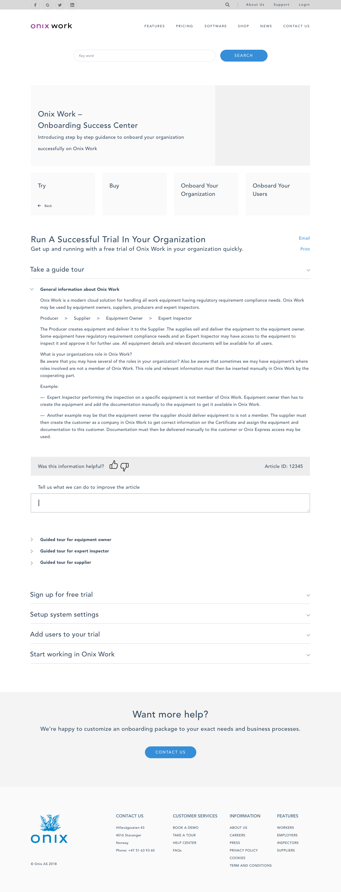
Project Brief
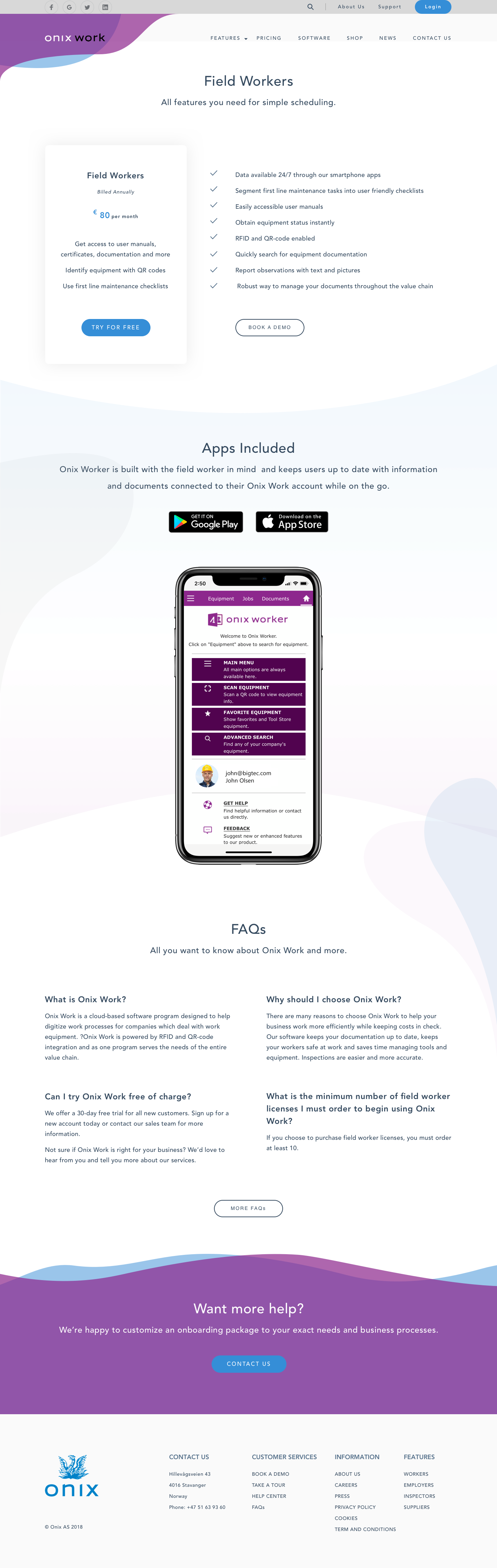
"Redesign the Information Architecture (IA) and key pages layout/wireframes of Onix Work website. Especially focus on Onix Work product."
...
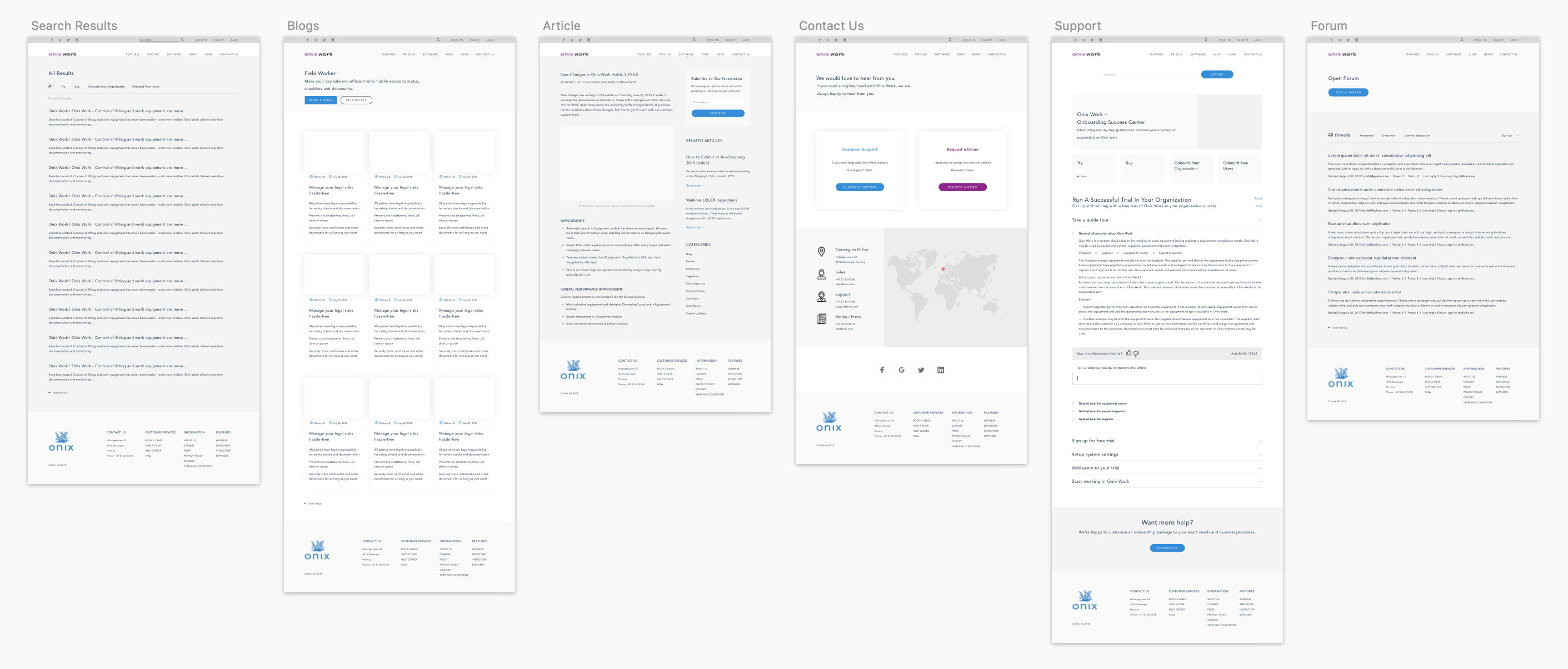
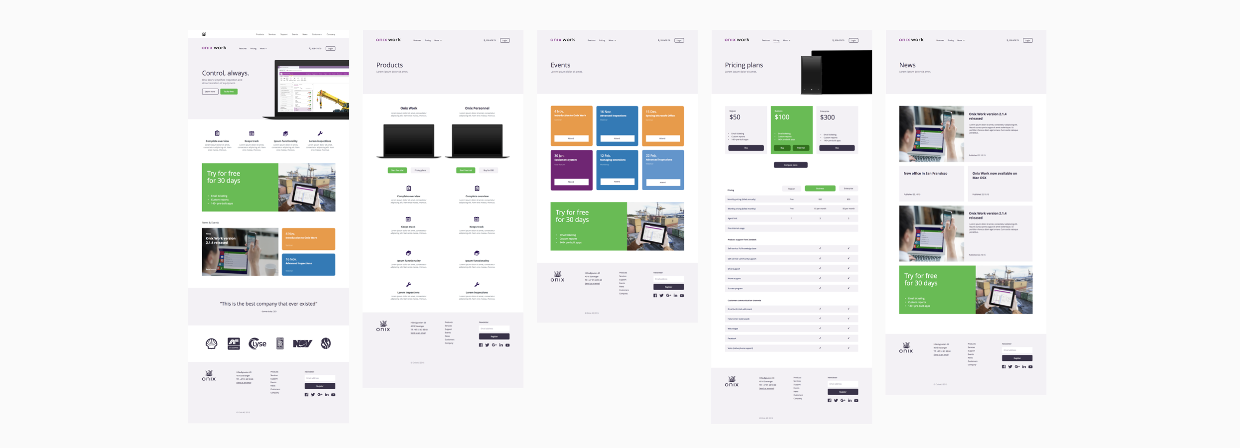
Process
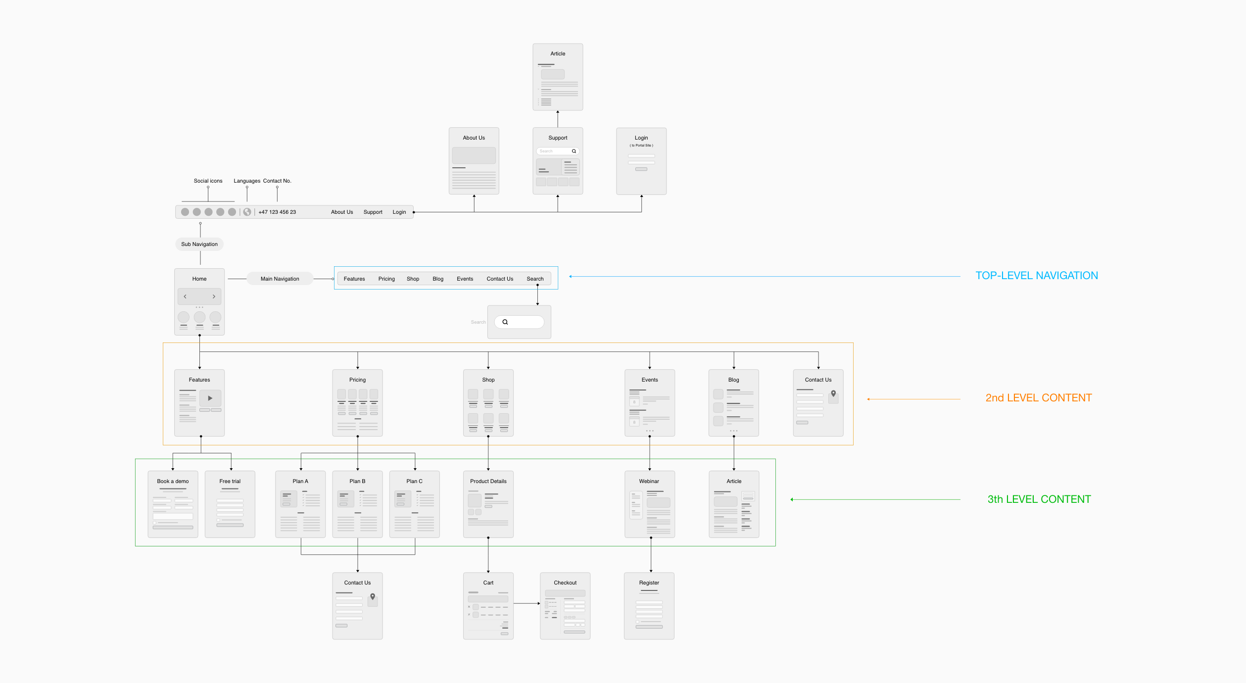
Project Research > Competitor Analysis > User Personas > Sitemap > Wireframe > Prototype
Project Research
Become Familiar with the Content
At the very first step, it's important to inspect the website asset that's available to understand business context, project requirements and what needs to be improved. Taking this as the valuable materials, I walked through the current site page by page and pull out all the content. This way, I can figure out what content is crucial, what content should be reinstruct. I typically start with the main navigation and keep going down to get overall.
Keys finding:
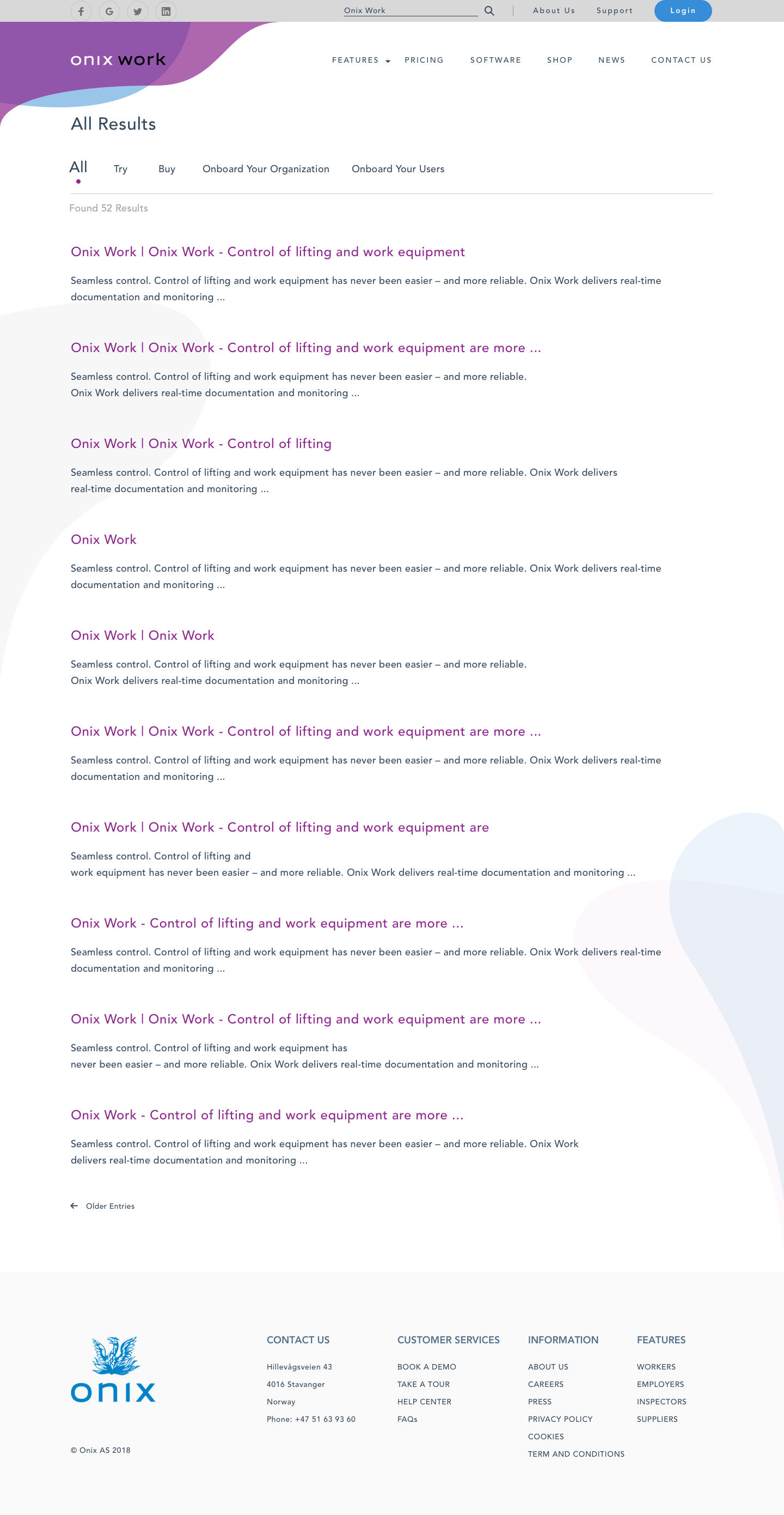
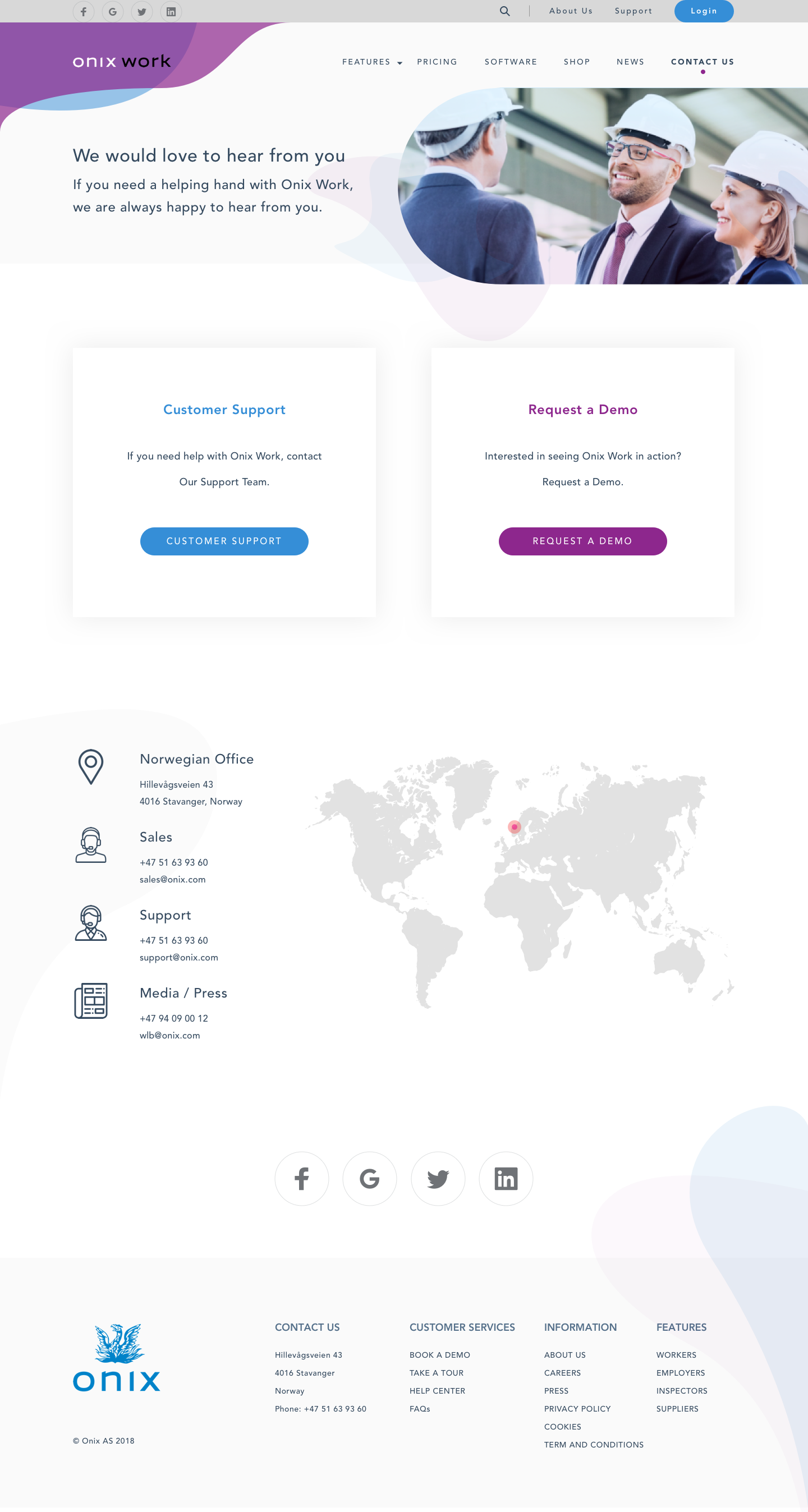
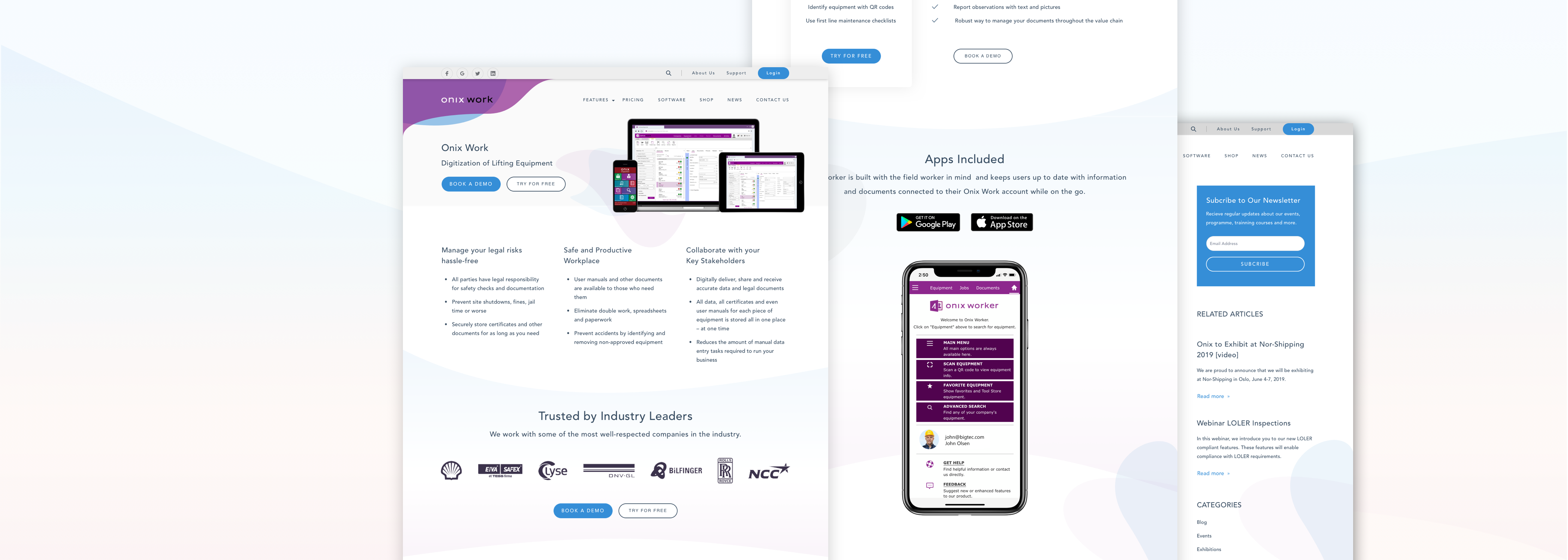
- The current site was so generic. Like an informative site, it had not focused enough on the company's key products which were the most important.
- Weak IA. Most links were not accessible through top navigation and were hidden within the content.
- Limitation of CTA buttons. The website just displayed one CTA only on a few pages. It made users confuse sometimes and didn't know what they can do next.
By talking to various people on the team, I was able to get a better picture of the project’s scope, identify the website focus, workflow, content, and features. From there, we came up with the following core types of content (some new, some existing):

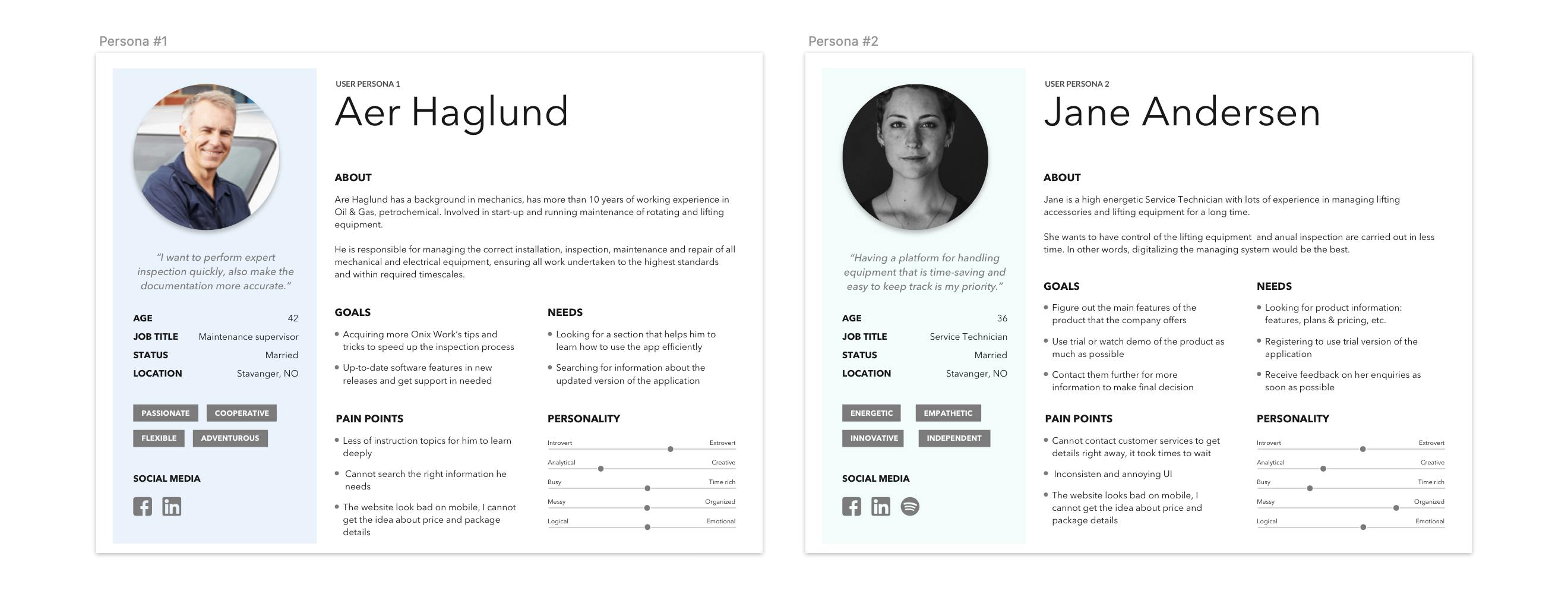
User personas
During the research I identified two different scenarios that kept my focus and developed the following:
- Scenario 1.
Returning users - around 270 client companies in total - who are using Onix Work and know how it works, want to find more plans & pricing, FAQs, new releases and support information. - Scenario 2.
New users - who don’t know about the product, want to learn more, book a demo or give a try.
Following that, here are two appropriate user personas:
Pain points
- Unclear Message. In general, users don't get much information about the product that website is offering at first glance.
- Confusing Information Architecture. The navigation as well as the content was displayed does not align with the way users really look for information. They don't know where to start and how they reach to their goals.
- Difficulty In Finding Help or Support. In general, users don't get much information about the product that website is offering at first glance.