Onix Worker

Mobile application

Team: Onix AS
My role: UX/UI Designer
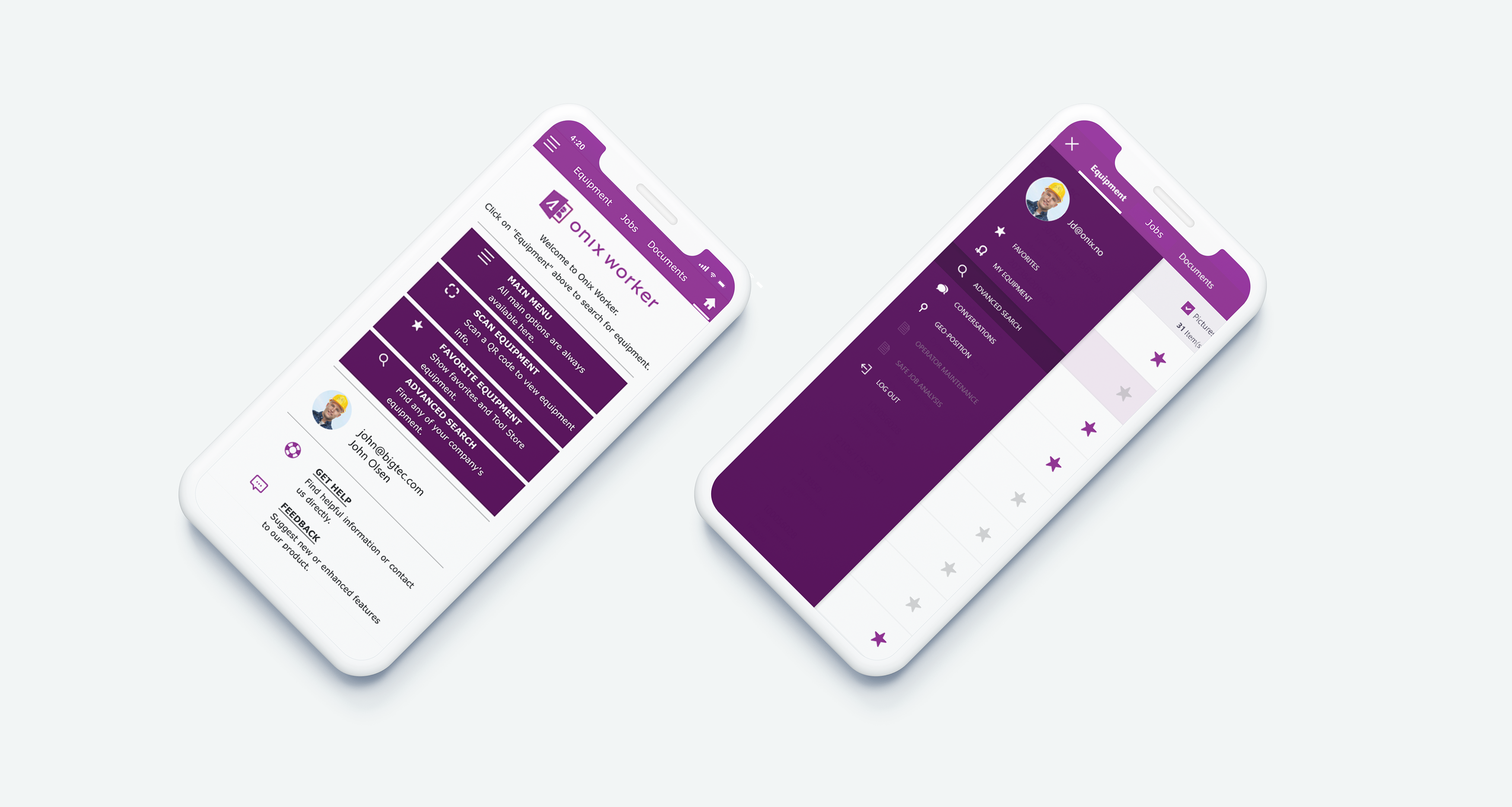
Onix Worker is an application, was developed for iOS and Android mobile devices. It supports workers do their daily jobs on equipment efficiently. Onix Worker keeps users up-to-date with equipment information by connecting to their Onix Work profile. Workers can easily access user manuals, safety certificates, operator maintenance checklists, and so on. Furthermore, users can also query equipment by searching and scanning the QR Code.

...

Process

Project Research > User Persona > Product Features > User Flows > Wireframe > Visual Design

Project Research

The Problem

In a workplace (commonly a large factory / warehouse) when the workers want to look for equipment details, its location, user manuals, or wonder that whether it meets safety standard to use, etc, they need to ask other co-workers for the information or using computer to search on the Onix Work web application, those tasks quite take time and inefficiently. Another problem is transferring relevant documents like equipment certificates, maintenance checklists, or other documents from the employers to them is really complicated. So they need a quicker way to keep the workers up-to-date with the lifting equipment they are working with every day.​

Target Users

The target users are field workers who work directly with the lifting equipment in the construction area, oil rigs, factories,... and they don't have much computer experience like the office staffs. One more thing that we need to consider is about their working condition, in fact in a factory, using the Onix Work web application to get equipment information via a computer seemed not feasible for this case. For these reasons, we need a simple and quicker way to keep them up-to-date with the essential information which is so important to their job.

Project Goal

Provide a user-friendly mobile application that allows workers obtain to the equipment's status, checklists, and documents easily in order to reduce the risk of accidents in the workplace.
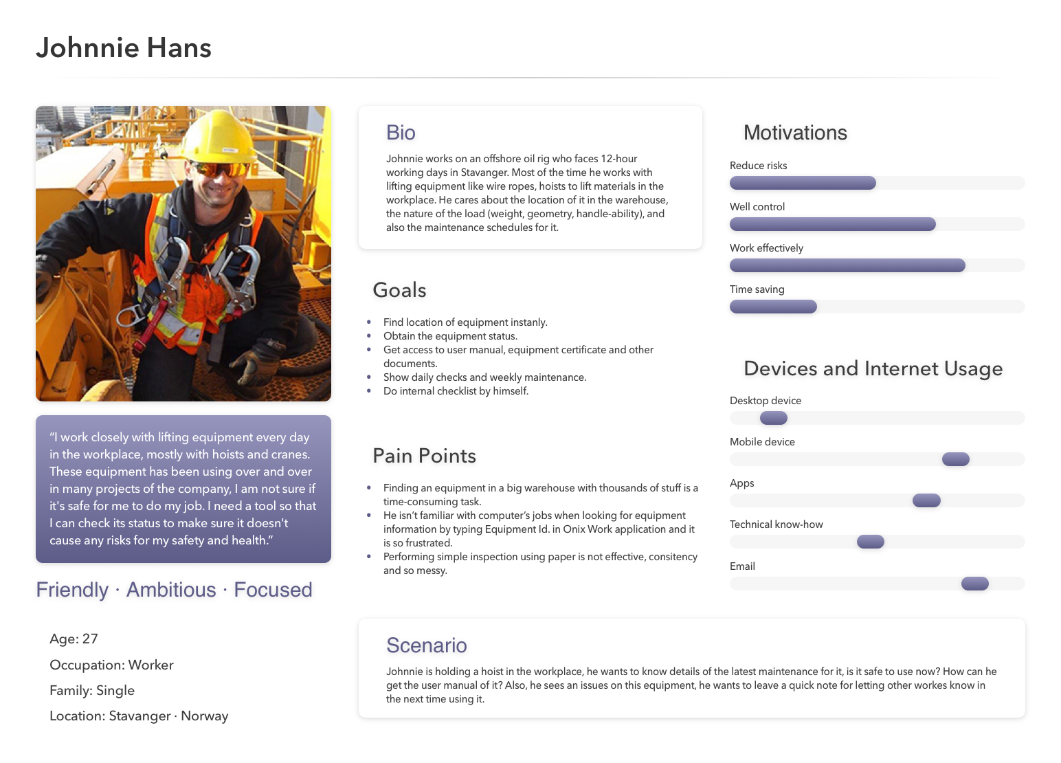
User personas

Based on discussion about the project's context, user stories, user's needs and goals, I was able to create a hypothetical persona.

User persona

Product Features

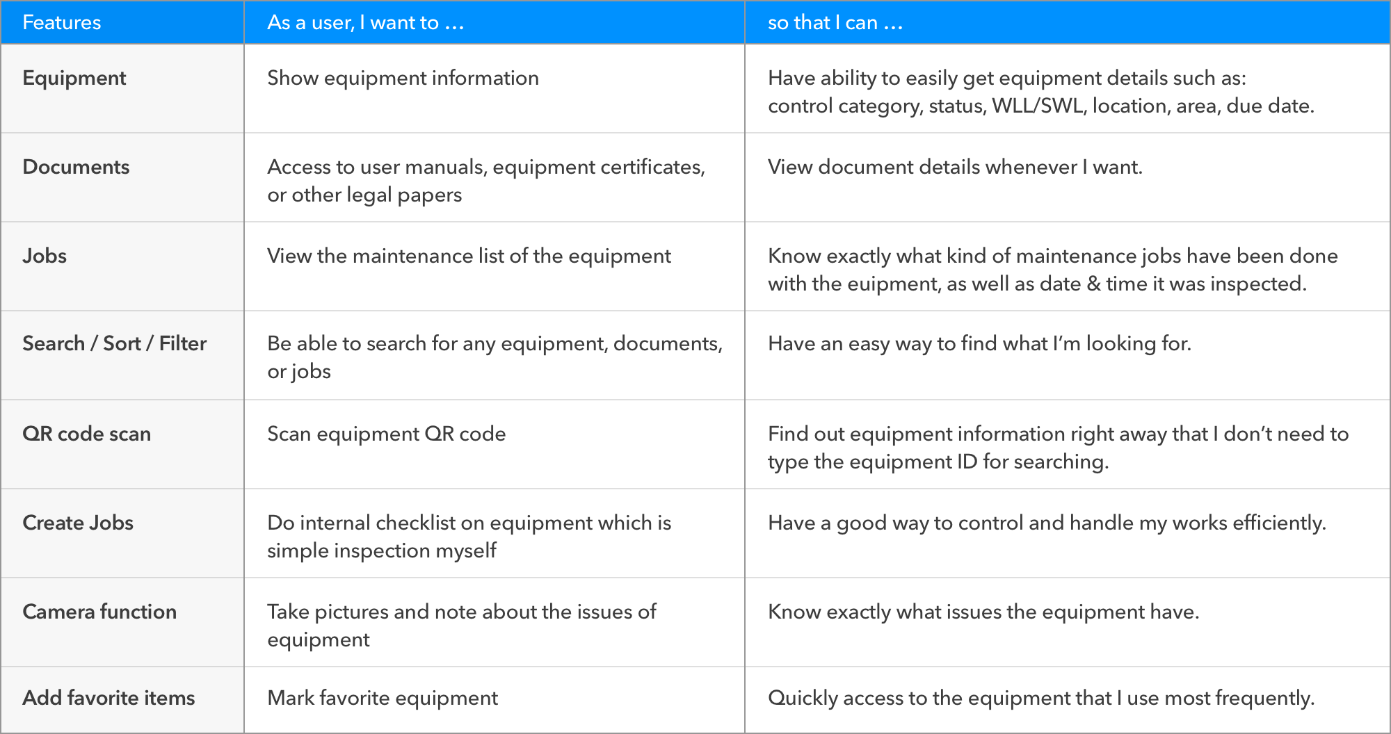
Next, in order to identify what it needed to accomplish on this product, we started out by summarizing users' needs, as well as what they think of features the app should include. Here are some key highlighted points:

  • The field workers want an easy way to check the equipment status.
  • Also it can keep them up-to-date with the documentation such as user manual, certificate.
  • They're able to do internal checklist on equipment by themselves.

Being able to define what the user would like in terms of functionality would help me develop plans to create the app’s main features from a user’s perspective.

Defining product's features

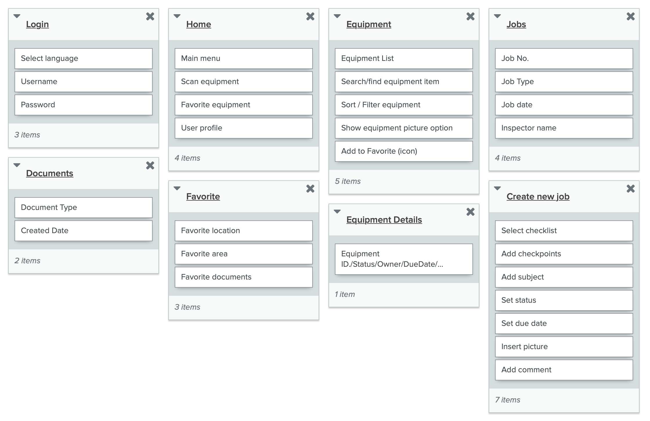
After the basic functionalities of the app were determined, the next step was to create a hierarchy of information that the users could understand and navigate. I used open card sorting method to group the categories that makes sense to them. By this way, I and the team can review the content listed in the app, also identify the most important used content.

An experiment of card sort was made via optimalworkshop

Design

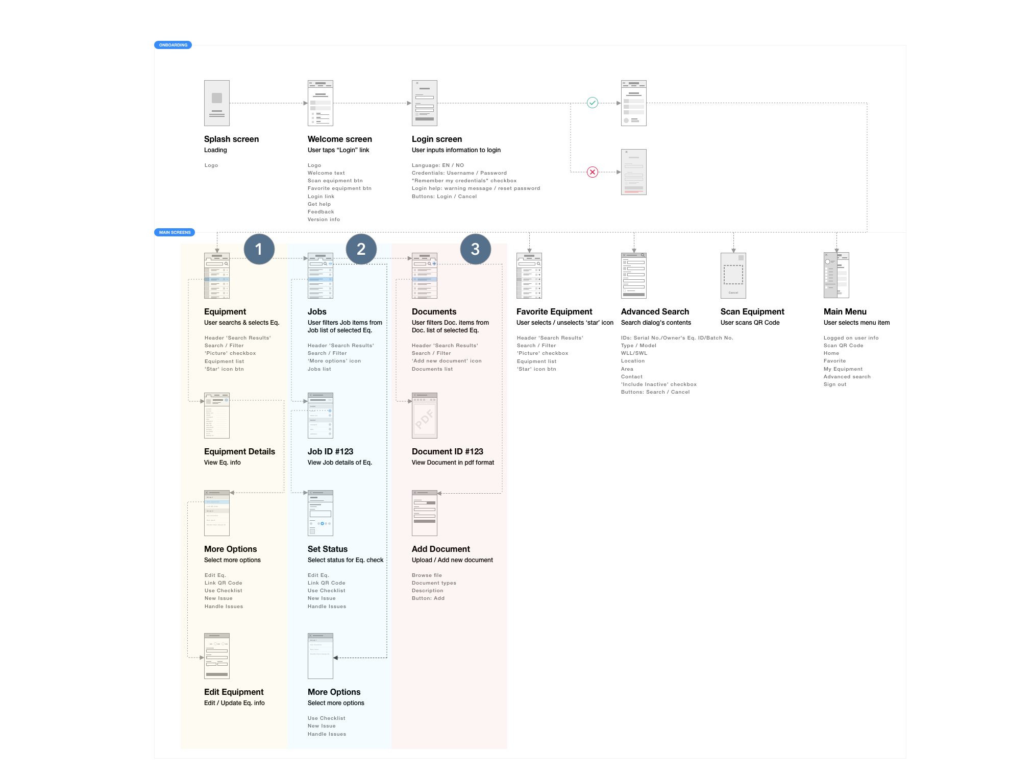
UX Flowchart

It’s important to define flows at the beginning of the design process, it gives me and the team a visual way to envision the flow of the app from start to finish as easily and comfortably as possible, furthermore, it helps us to see whether we’ve missed anything.

I decided to take 3 points: Equipment, Documents, and Jobs which were both frequent and important, so these would be the features I would focus on when planning my designs.

Onix Worker UX Flowchart


Wireframe

While understanding and visualizing the user flows, I have a better idea as to what the UI would look like. I used Adobe XD to get a better visualization of the app and its contents, such as the colors, positioning of the contents, etc.

Low-fidelity wireframe

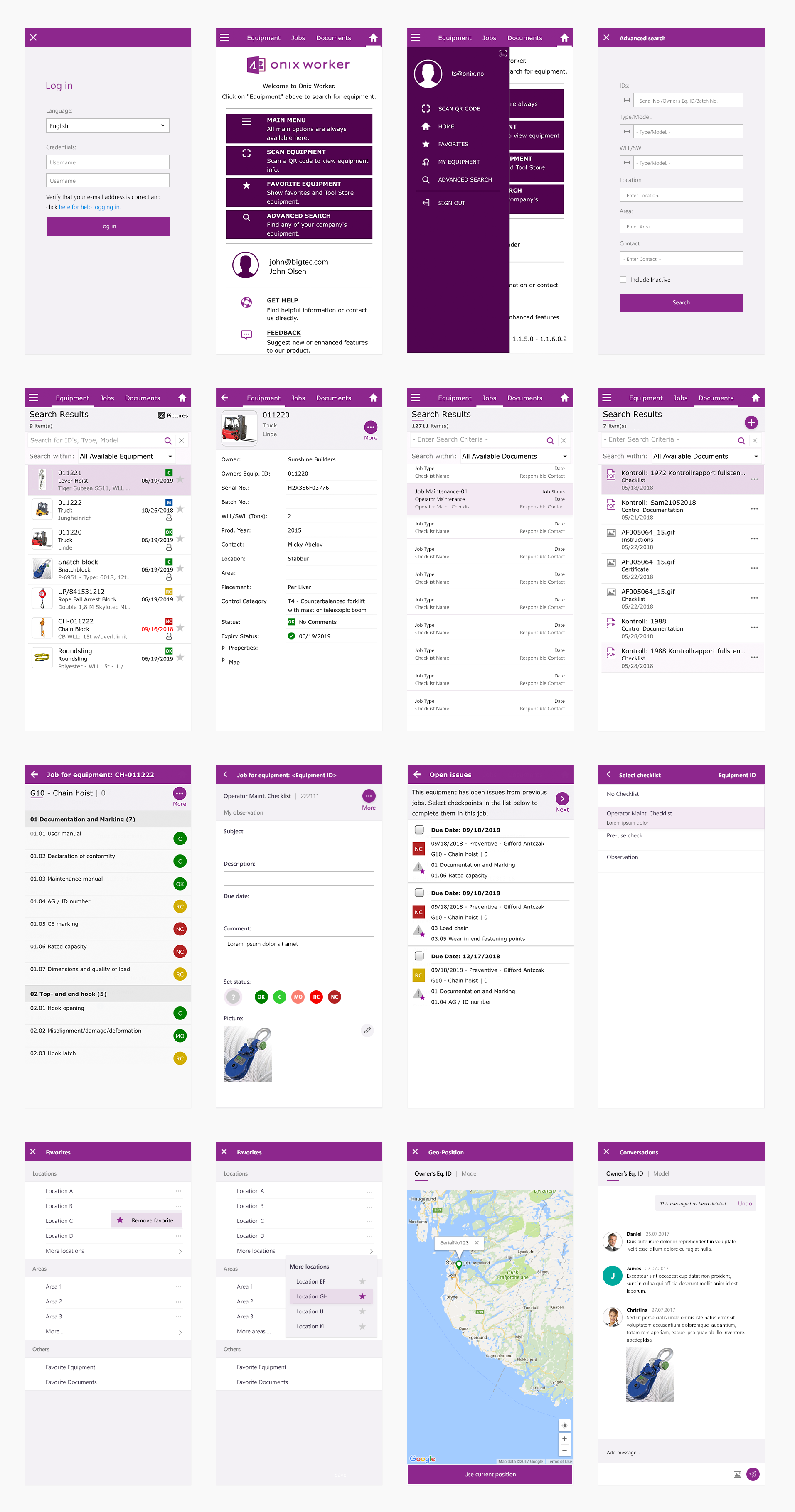
Visual Design

I went through some design iterations and tried to create consistency between Onix Worker and the other tools that we had implemented before, the purpose was letting it belongs to the main design system of Onix.

High-fidelity prototype

...

Project Learning

  • Use familiar screens. This makes the process of browsing information less daunting and more likely that users will complete it without being confusing, as well as allows users to interact with the app without a learning curve.
  • Improve collaborative working. Creating Onix Worker was such a fantastic opportunity that I had the freedom to experiment not only in the interface design but also had a chance to try a variety of ways to work efficiently with the mobile development team.