Redesign VPL App
Mobile Application
Personal project
My role: Product design
Vaughan Public Library (VPL) mobile app is created to offer the VPL's users on the book's searching and borrow tracking. Additionally, the app provides readers a higher intuitive, appealing and easy-to-browse experience when using it.
Background Information
Vaughan Public Library (VPL) is a public library system in Ontario, Canada. The VPL extends public access to information and services through 10 branches of the library, physical and virtual (www.vaughanpl.info) as well as a mobile application. As a user, I felt that it seems to be a highly practical app but there is still a constraint about search feature which is quite complicated. Moreover, the design interface could be improved to be more attractive. I decided to redesign this app as a personal project: Solve The Problem I Met In Life and I think a new look would increase the usability of the app and hope that users will be more enjoyable when using it.
...
Process
Product Research > User Research > Empathy Map > Ideate the solutions > Usability Test & Revise
Product reseach
Target users & Use cases
I started the project by defining the main target audience group: the LOCALS. I focused on establishing a thorough understanding of the target audience acquired from their behavioral patterns, possible needs and goals.
Follow that, I conducted an analysis of the challenges they might be facing and here are the following use cases for them:
- Search/browse books
- Get descriptions & reviews for books
- Borrowing & returning books
- Find & download ebooks, audiobooks
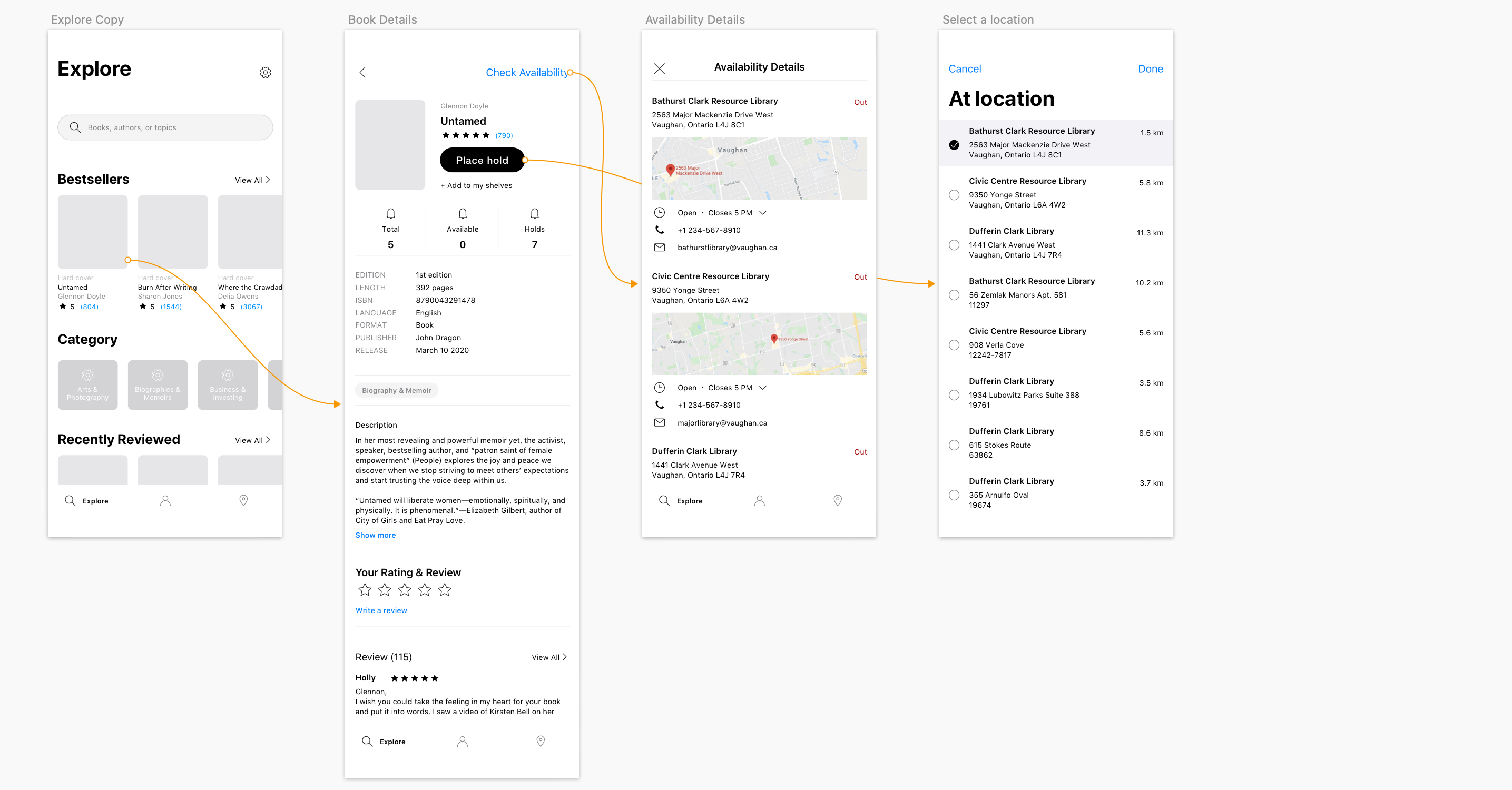
- Check availability & map the locations
- Check due date & renew
- Check branch hours or get directions

Users feedback
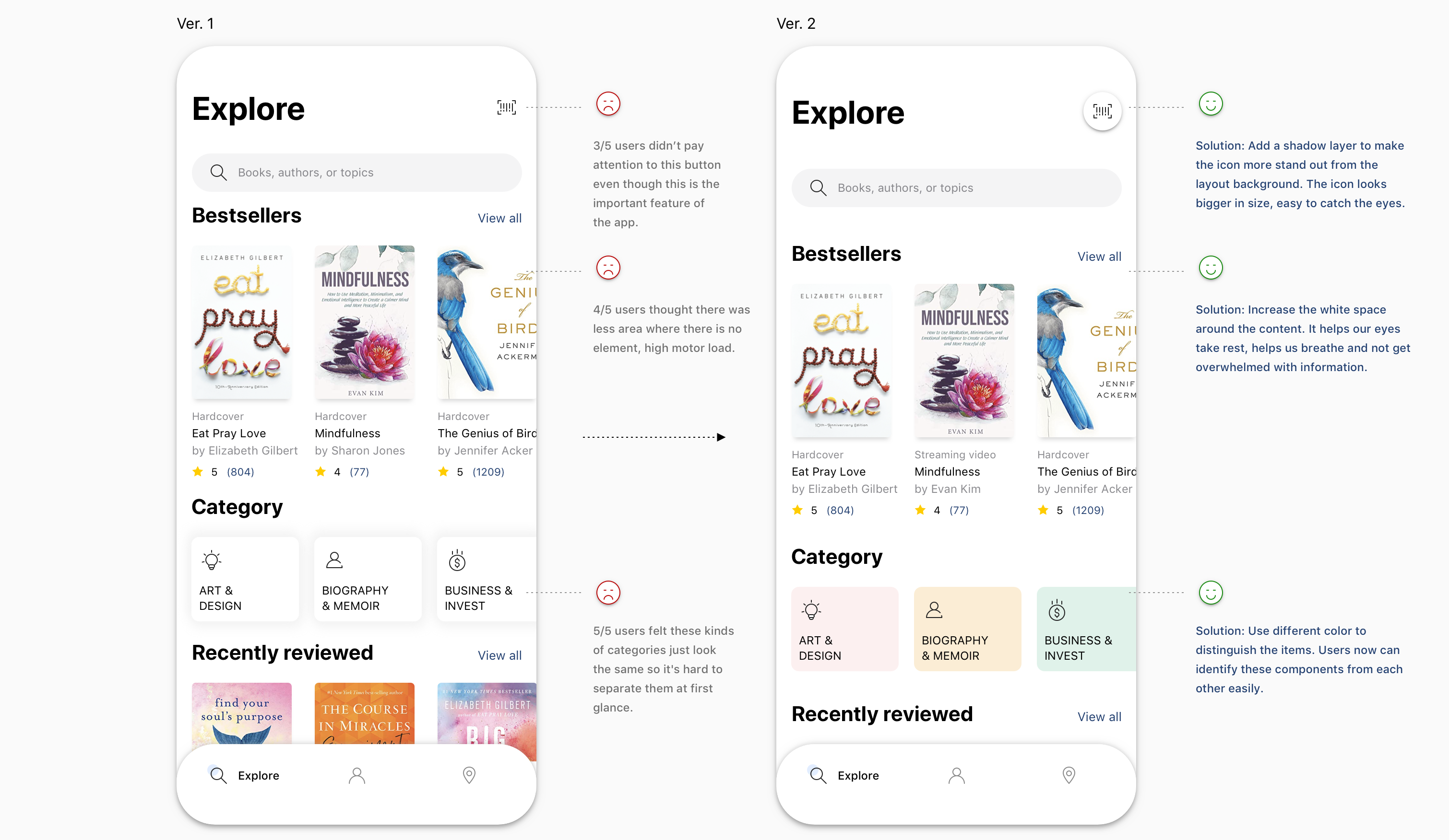
Besides, reading the users feedback for this app on Google Play and App Store helps me get more insight about what's good and what needs to be improved in order to meet the users expectation. Based on the collected feedback, I grouped those comments into three main groups: UI pain point, Search & Filter pain point, and Explore books pain point. The followings are several key takeaways from that.
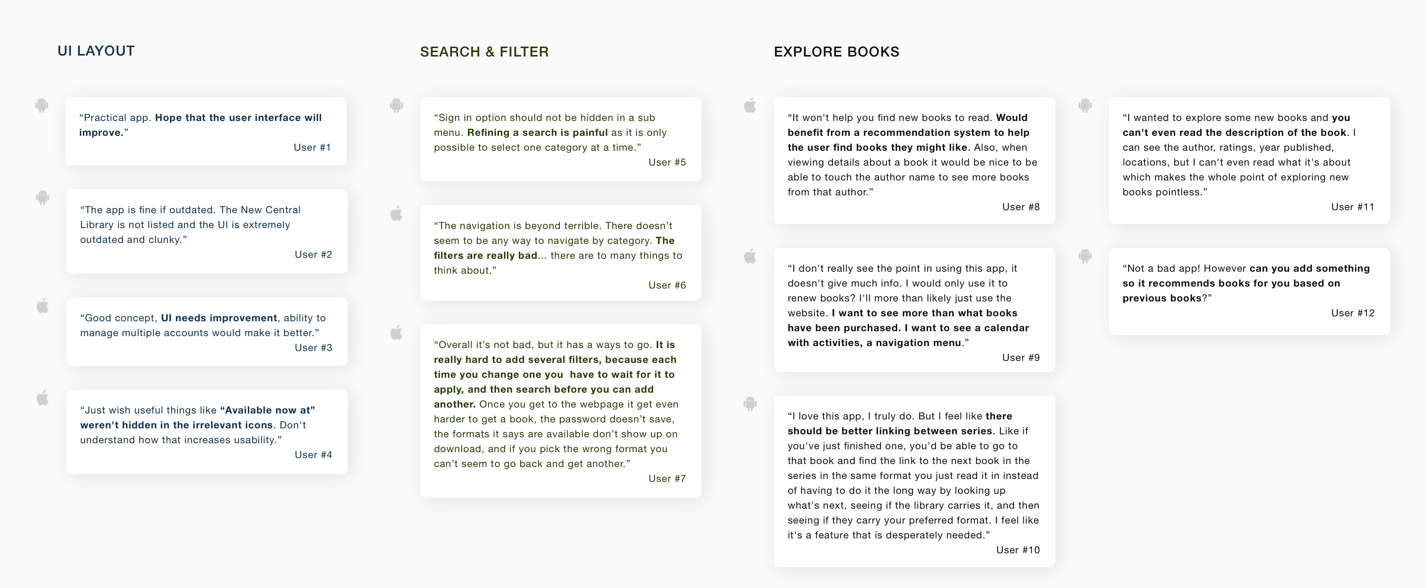
- UI Layout. Most users commented that the app provided the basic features but it needs to be improved the UI, that they don't like the look. It feels like 80s design, clunky and outdated.
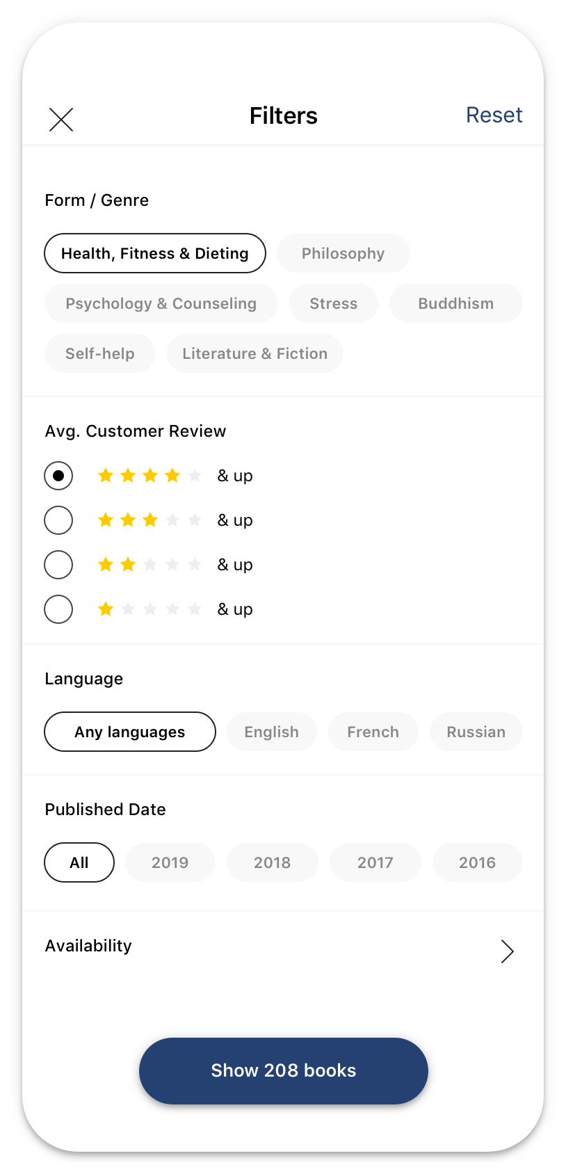
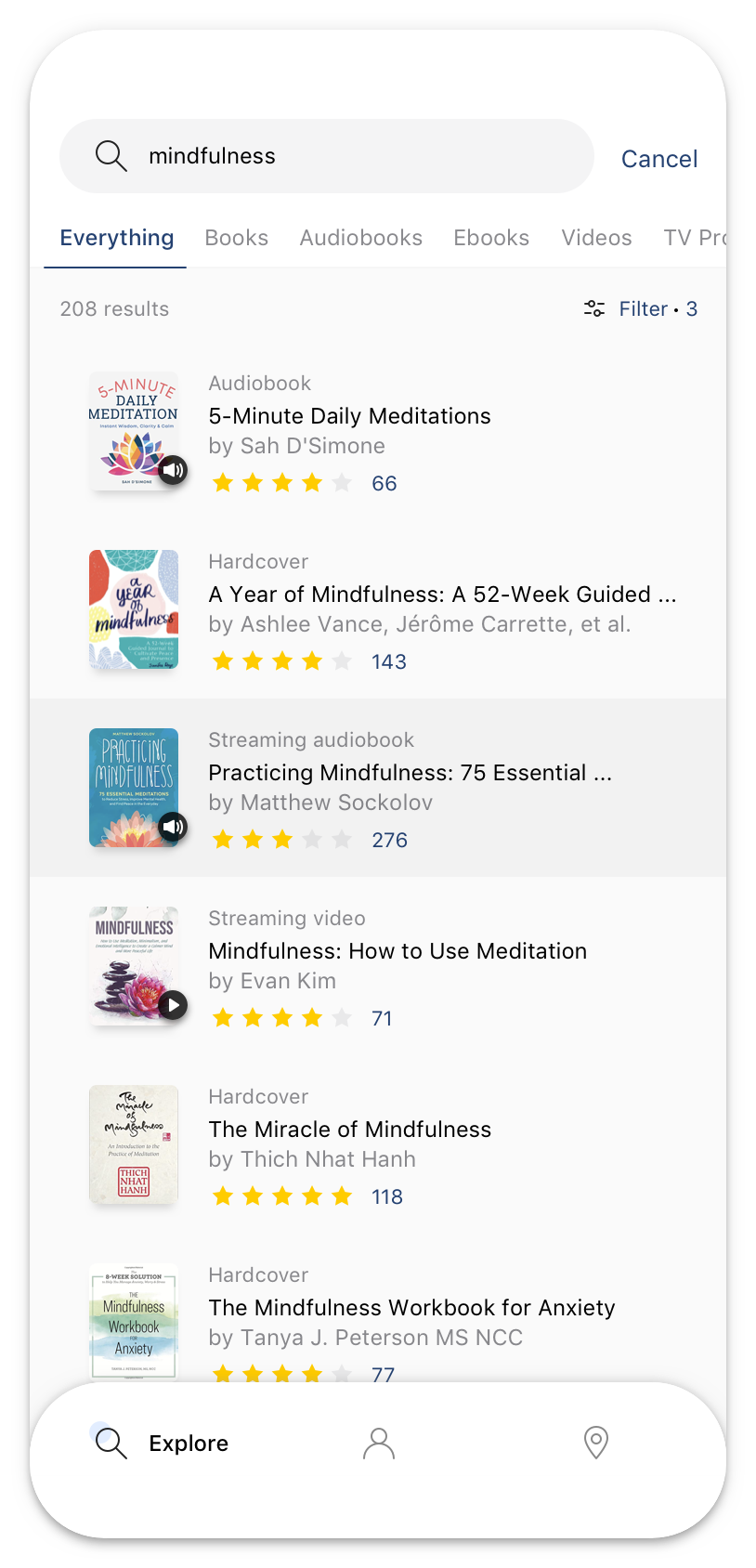
- Search & Filter. There are many filtering options that allows users to narrow down a number of results, however these options makes them confuse and they're not sure which criteria should be used. Furthermore, it is only possible to select one category at a time.
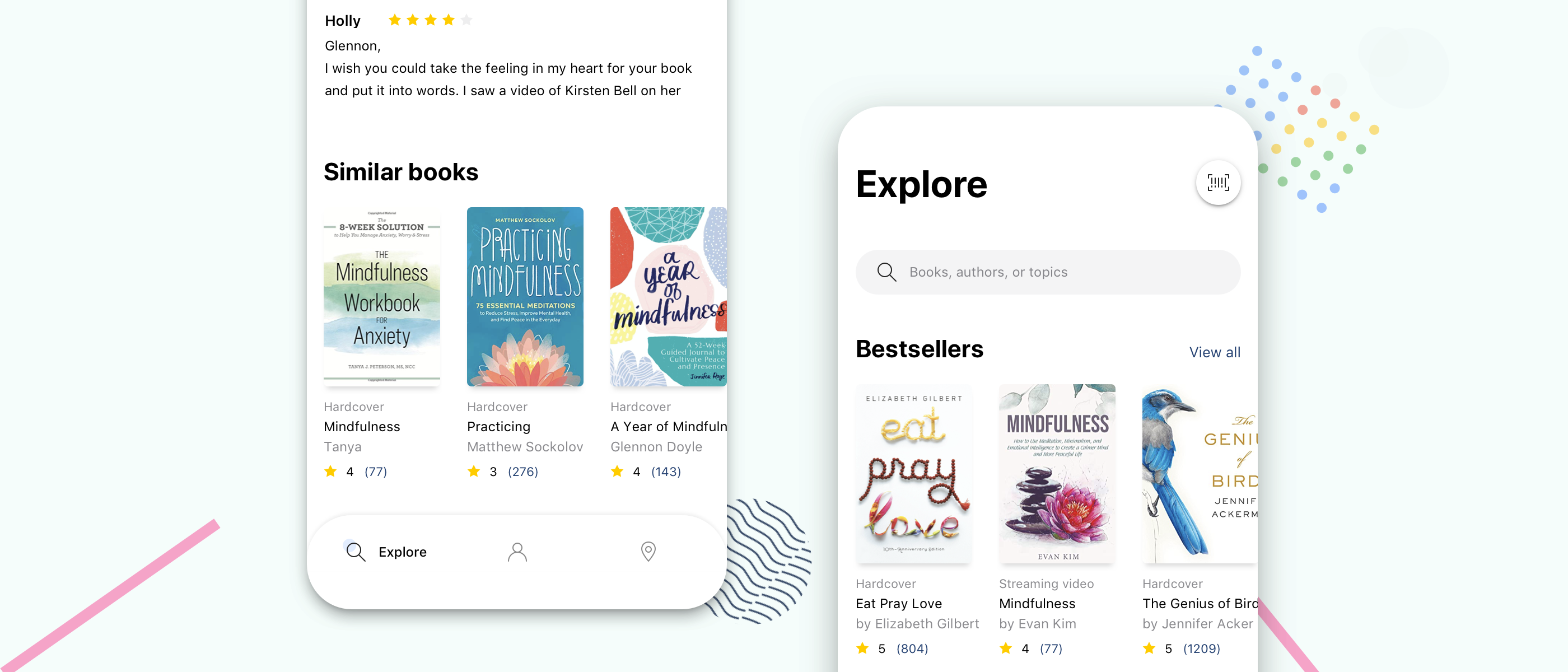
- Explore books. As some comments said that it's hard to find a new book to read since it's lack of book's description and reader's reviews as well. Also, there are many suggestions about adding the "book suggestion" feature which based on the previous books or books from the same series/author that they had read before. That's kind a good idea to think about.
User Research
User Interview
I conducted quick interviews with 3 users to gain deeper insight about their experience with this app. Some evaluative questions were given out:
- Why do you use VPL app? What do you use it for?
- How often do you use the app?
- What is your main goal when using the app?
- How do you find a new book to read?
- Is there anything you often look for on the app that is missing or hard to find?
Key findings:
- Ingeneral, users noted that this is a convinient and handy app, it does the basics but it's not intuitive much.
- From the functions, experience related to finding a book, including searching & filtering the results got the bad comments. Follows users, they can quickly find exactly the book they need unless somebody recommended them before, otherwise, they felt impatient and frustrated sometimes during searching process.
Based on that answers it was possible to create the empathy map.
Empathy Map
An empathy map allowed to understand the user more. Thanks to this I was possible to determine what the user thinks, feels, sees, hears, says and does. Based on this I have identified a wide range of possible pain points.

Pain points
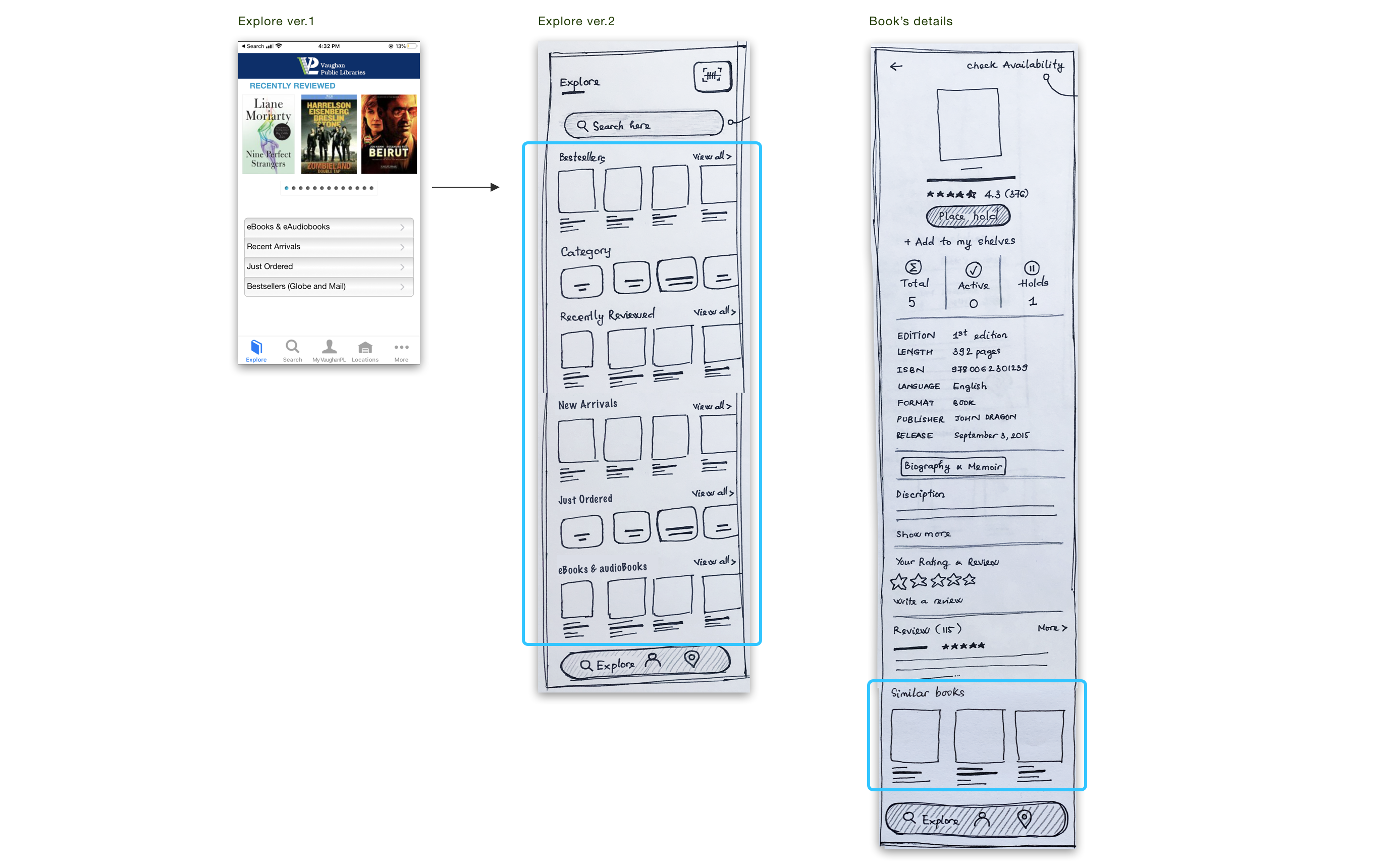
- Lack of book suggestion in Explore screen and below of each book's details. On Explore, it just shows Recently Reviewed Books, to see the others such as New Arrivals / Just Ordered / Bestsellers / eBooks, users have to select to see.
- No search suggest drop-down list feature to provide options to select.
- Can't complete filtering search at once. Each time you change one you have to wait for it to apply, and then search before you can add another.